Connected devices are leveraging rapid developments in voice control and machine vision to enable more seamless user experiences known as natural user interfaces (UI) or zero UI. But “seamless” and “natural” to whom? And in what context? An interaction that’s effortless for one user may be inconvenient or impossible for another, depending on many factors such as age, abilities, familiarity with tech, or the situation in that moment. The infinite variety that makes our world and our work so rich can pose some major design challenges. How can we best serve this diversity in user experience as we develop connected products?
As engineers, we’ve got to account for multiple modes of interaction to create the most accessible, inclusive products. For the interaction to feel natural, the interface must support freedom and flexibility. At Synapse, we combined physical and digital interfaces into a type of novel interface that we call reactive physical control interfaces (RPCIs). These hybrid interfaces allow various modes of interaction, resulting in the most intuitive experience for the greatest range of users and situations.
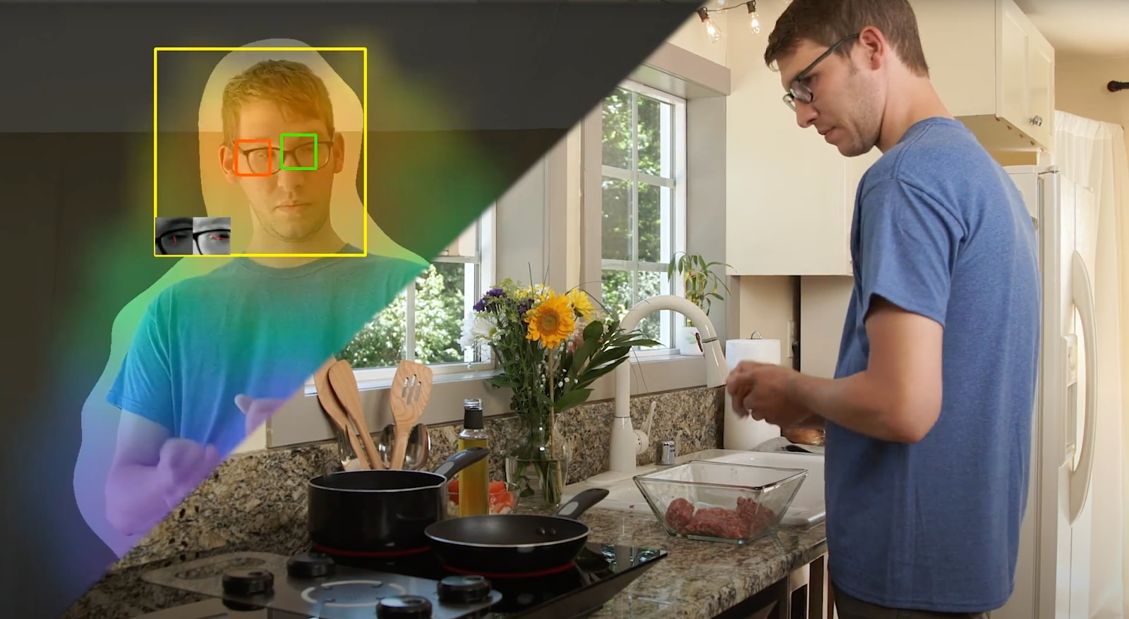
For instance, our voice and gaze cooktop demo, Hobgoblin, can be controlled by knobs as usual, or by the voice user interface that we’ve enhanced with gaze tracking. If I say, “Alexa, turn that burner to high heat,” Hobgoblin uses its gaze tracking and knows which of the four burners to control based on where I’m looking. If I need to adjust the burner temperature but my hands are dirty from cooking, it’s ideal!

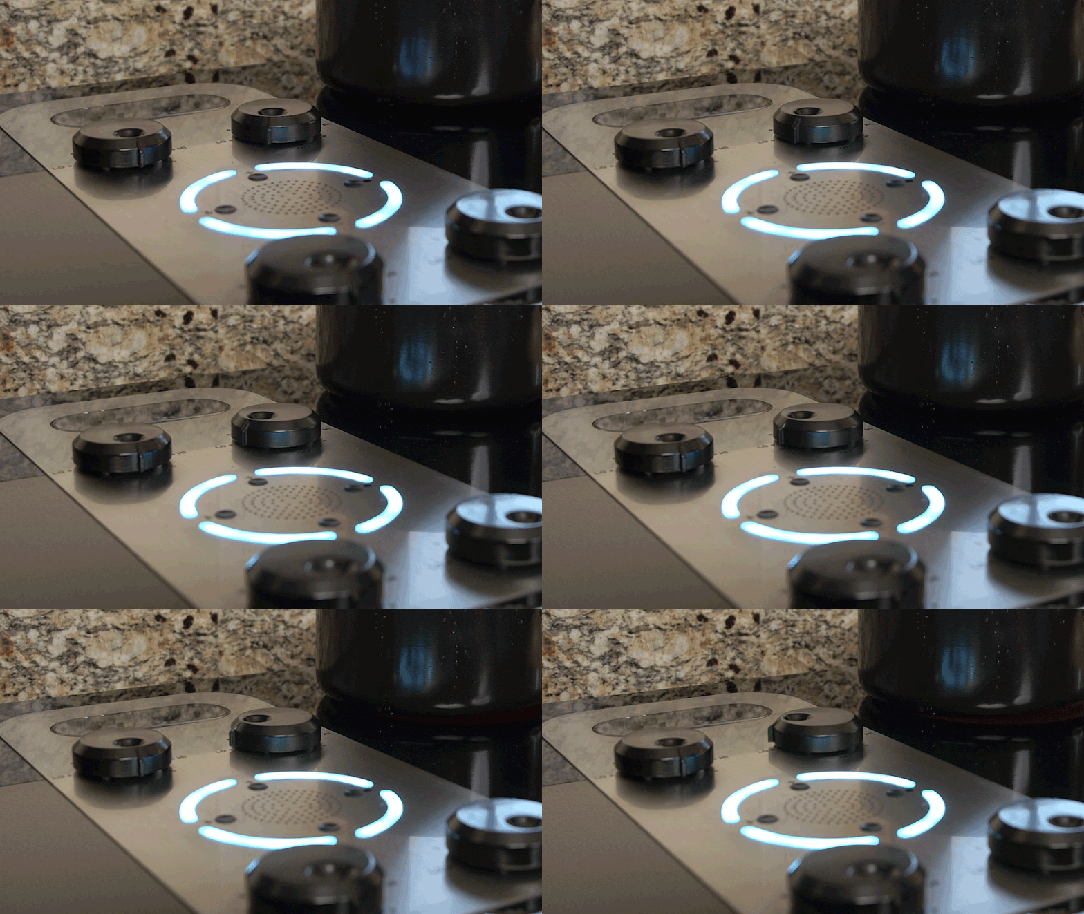
But after that voice command, what happens to the knob? Since I often glance at the knobs to see how hot I’ve set a burner, the knob must stay in sync with the digital control. Otherwise, the interface is no longer intuitive—and worst case—it’s dangerous. What if I glance at the knob to see if the burner is off, but the knob is out of sync with the burner? Yikes. That’s where the reactive in “reactive physical control interfaces” comes in. A reactive physical control interface can respond to the digital means of control by self-actuating to reflect its functional state, such as low, medium, or high heat. We motorized the knobs on Hobgoblin so that they can move themselves and always match the commanded stovetop setting.

RPCIs thoughtfully combine physical and digital input options and use the various interfaces to complement the abilities and preferences of different users. Whether an individual has a mobility impairment or has their arms full of groceries, using digital control (such as voice control) to bypass the physical interface can make all the difference in usability. Meanwhile, keeping the knobs on this voice-enabled stovetop is important for another user who might avoid voice control because they are deaf, or for your user who doesn’t want commands to their voice assistant to interrupt their conversation with a friend.
Preserving the familiar physical interface on a digitally-connected product also helps people avoid having to make huge conceptual leaps that diminish usability. Your user could be an older adult who has deeply embedded habits after using a stove with knobs for the past seventy years. The thought of using voice control may overwhelm them because they lack a conceptual model for it. This may not be a big deal when requesting Alexa to play a certain song, but with safety-critical devices such as a stove, seeing the output through a physical interface can be essential.
Replacing traditional physical interfaces with touchscreens or touchpads can make products inaccessible for people with disabilities like visual impairments, impaired fine motor skills, or reduced touch sensitivity. In what other cases are physical controls vital to usability?
Physical controls (such as buttons, switches, knobs, and sliders) are ideal for interfaces that we expect to:
- Provide physical or haptic feedback, which is often used to aid precise adjustments or provide that momentary confirmation that we subconsciously crave.
- Be intuitive: regardless of language or familiarity with tech, any user knows what it does.
- Be fast to use: milliseconds matter, especially in safety-critical contexts.
- Be most frequently used: the user may be context switching a lot when using this device, so don’t give them any extra hurdles, options menus or distractions.
For example, I don’t want to be restricted to controlling my blender or barbeque through an app. In the case of stovetops, customers switching from gas to electric or induction stoves prefer knobs over touchpads, arguably for all four reasons above.
As Kat Holmes explains in Mismatch: How Inclusion Shapes Design, a disability is not a permanent health condition. A disability is a mismatched human interaction. Designers and engineers must remember that in addition to the diversity of abilities among people, a given person’s abilities and preferences change over time, such as with age or injury, or situation.
Natural UI and zero UI need inclusive design. After all, what’s “natural” is subjective. Considering people and situations outside of our own personal norms and doing user research with a diverse set of participants is crucial for fulfilling the potential of natural UI and zero UI. By making multimodal interaction intuitive, RPCIs are well-suited for elevating the physical interface while making digital transformation accessible, in more ways than one.
Read more about Zero UI capabilities at Synapse here.
